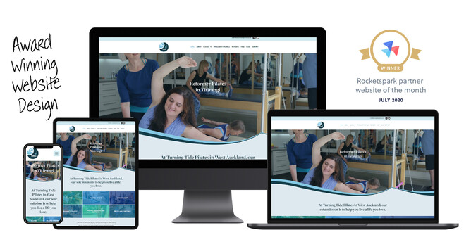
I was very excited to win Rocketspark’s Partner website of the month for July 2020 for turningtidepilates.co.nz. Such a wonderful way to be recognised for the value I provide to my clients. It is also a real honour as there are some very talented design partners around so I was up against some very tough competition.
There is so much more to building a website than just making it look pretty (although that is important too). So, what makes an award-winning website?
A clear goal
Start with knowing why your business or organisation needs a website. What do you hope to achieve? It may be to build brand awareness, make sales, capture leads, show off a portfolio or share information. By understanding your goal, we can create the best solution.
Professionally written copy and photographs
I can’t stress enough as to what a difference it makes when working with content that has been written by an expert. Writing for the web is different to writing for a brochure or an article. You have to keep Google happy, while being engaging enough for a human reader. Our attention spans have got shorter, so your copy needs to grasp viewers attention and hold it.
From a technical point of view; your photos need to be of a high enough quality to look fantastic on high resolution screens and devices. And from a branding viewpoint; the old adage that “a picture speaks a thousand words” is true today more than ever. Show off your brand, your products and yourself so that visitors to your site get a first impression they will remember for the right reasons. Low quality, unprofessional photos on your website or any marketing collateral will give a poor impression about your business and the products and services you offer.
Make sure that the tone of voice, the amount of text and photos and the style of photography all work with your brand and target market.
Understand your target market
Like all marketing projects you need to be really clear on who is your target market. Who are we trying to attract? Who wants to and has the means to purchase from you? It is impossible to create a successful website that appeals to everyone, so we target your ideal customer instead.
Add a creative touch
The use of textures, flourishes, shapes or hand drawn illustrations help to break up the text, create interest and appeal and push your website from the mundane to divine. It’s important here to not go overboard or the website just becomes overwhelming instead.
Embrace new features
Rocketspark are continuously bringing out new design features which is always very exciting. By making use of these new features when they are released, we can make sure your website is up-to-date with new trends, style and functionality.
Great spacing
Unlike print design where we are constrained by the edge of the page, pixels are free so the page can be as long as we like. This means generous spacing between sections, around elements and breaking up the text blocks to avoid the dreaded walls of text you see on some sites, which I am sure is never read. Don’t be afraid of white space – it provides breathing room and gives each section a clear hierarchy.
A straightforward customer journey
This means easy to follow navigation and a well thought out user experience. We ensure there are clear calls to action, lead capture forms and easy to find contact details. Really there is nothing more frustrating than having to hunt around a website for a phone number.
Utilise SEO tools
Rocketspark websites have inbuild, innovative SEO tools. However, these only work when they have been setup properly. The same applies for other platforms. Make sure the basics are covered: only one H1 heading per page, alt tags on photos, title tags, description tags and keywords.
Consistency, consistency, consistency
Make sure your site is consistent with your brand. Yes, the obvious is the colours and fonts, but also the feel and the style. Each page and section has to have a coherent and consistent look throughout the whole website – you don’t want visitors thinking they have suddenly gone to a different site.
Design for mobile
We don't just design for mobile, we check what your site will look like and how it will function on a variety of screen sizes as we design. With an ever increasing number of people viewing websites on mobile, especially the first time they visit your site, it is so important that it looks great and works on mobile.
So, there you have it – a whole lot of thought and planning needs to go into building an award-winning website. If you want a website that will achieve your goals do get in touch. Maybe your website will be the next Rocketspark Partner Website of the Month.


